
The road to success as a day trader is difficult. You need to be able to evaluate stock charts by looking at market data, spotting patterns, and taking reasoned actions in addition to understanding the stock market and the technical jargon used by traders.
On trading platforms, stock charts which present essential market data are frequently employed. Any successful trader must be proficient at reading stock charts since even a small delay in analysis can mean the difference between a winning and losing trade.
You will learn about the idea of stock charts, the several chart types that are available, how to interpret them, and methods for spotting potentially profitable transactions in this manual.
Table of Contents
- Overview of Stock Charts
- Essential Tools for Understanding Stock Charts
- Analyzing Stock Chart Patterns
- Interpreting Stock Market Data
- Approaching Stock Chart Analysis for Day Trading
The road to success as a day trader is difficult. You need to be able to evaluate stock charts by looking at market data, spotting patterns, and taking reasoned actions in addition to understanding the stock market and the technical jargon used by traders.
On trading platforms, stock charts—which present essential market data—are frequently employed. Any successful trader must be proficient at reading stock charts since even a small delay in analysis can mean the difference between a winning and losing trade.
You will learn about the idea of stock charts, the several chart types that are available, how to interpret them, and methods for spotting potentially profitable transactions in this manual.
Overview of Stock Charts
A stock chart is just a visual representation of how the price of a stock has changed over a certain amount of time.
Stock charts plot points that indicate the stock price at a particular interval, much like any other chart. For instance, a daily chart displays the stock price at market close each day, but a 15-minute line chart reveals the stock price every 15 minutes.
Your desired trading timeline will determine the style of chart you choose. Options range from charts that update prices every one second to weekly charts that show the price as of every Friday’s market closing.
Stock charts are a quick and easy way to quickly understand the performance, trend, and probable future moves of a stock. While not always accurate, stock charts can be used to spot lucrative trading opportunities with skill.
Essential Tools for Understanding Stock Charts
It’s vital to become familiar with the various chart types in order to start reading a basic stock chart.
You can find stock charts on your stockbroker’s platform or on well-known websites like TradingView or Yahoo Finance.
You can make your preferred chart type the default on your selected platform once you’ve made that decision.
Line charts, bar charts, and candlestick charts are the three styles of stock charts that are most frequently used. Depending on your unique demands, each type can be utilized for a variety of purposes and has unique strengths and limitations.
Line Graphs
The line chart is a simple stock chart style that resembles other types of charts.
A line chart, as the name suggests, just shows the stock price as a line that changes direction. Only prices are shown on this chart, which offers very little information and makes it difficult to identify patterns. Even so, some traders continue to use line charts to spot broad price movements.
Since just one variable is used to represent price movement, the line chart’s simplicity makes it simpler to see trends. It can also be used to determine levels of support and resistance.
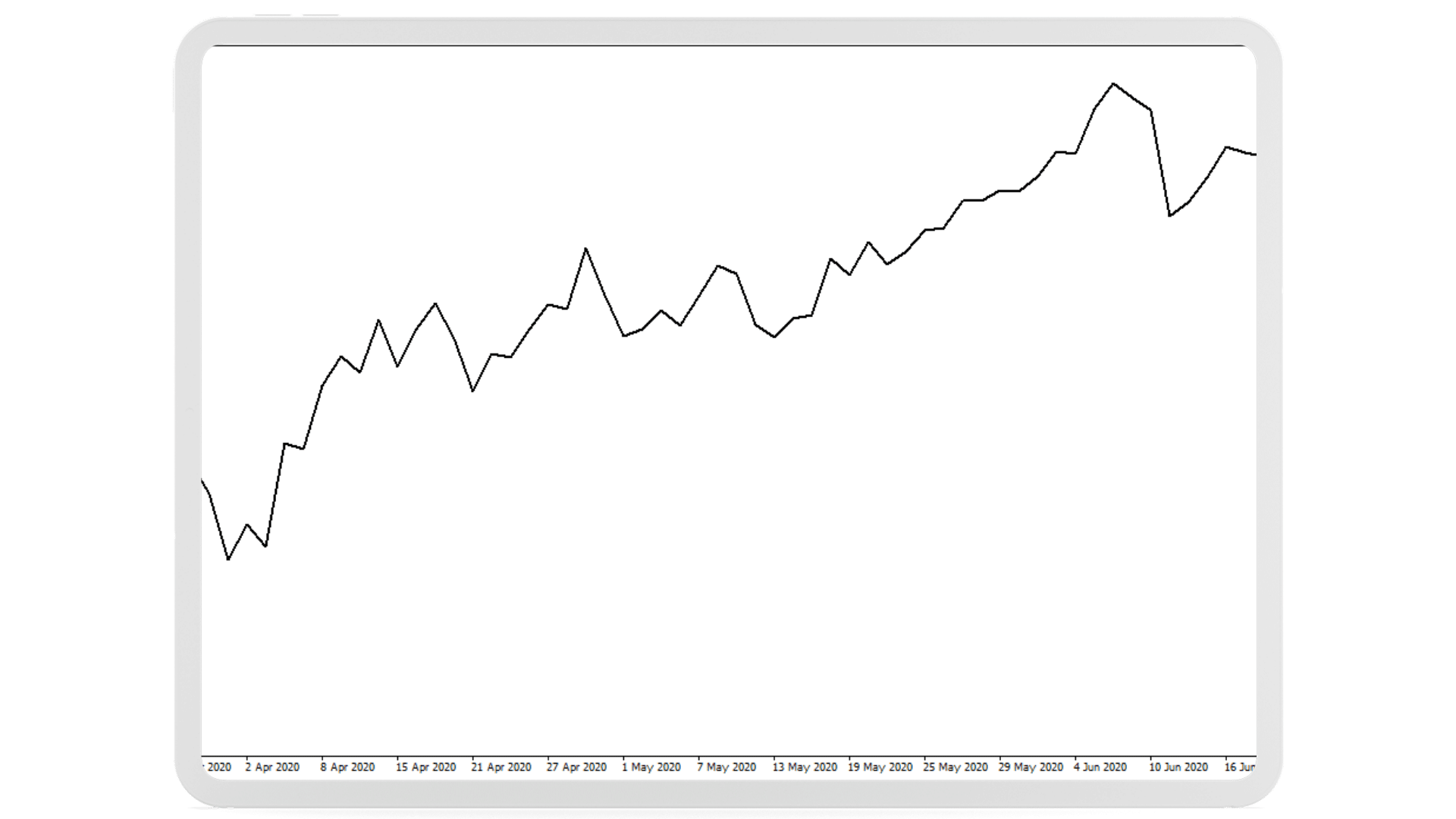
Line Graphs
Bar Graphs
While more complicated than line charts, bar charts show the four main price components of a stock: the open price, close price, high, and low. This kind of chart is created by drawing a straight line connecting the day’s high and low points, with the left tip representing the open price and the right tip representing the close price. Bar charts, particularly for longer time periods, can be challenging to read, and it’s not always clear whether a day was bullish or bearish. These issues are addressed by candlestick charts, which is why they are the most popular stock charts.
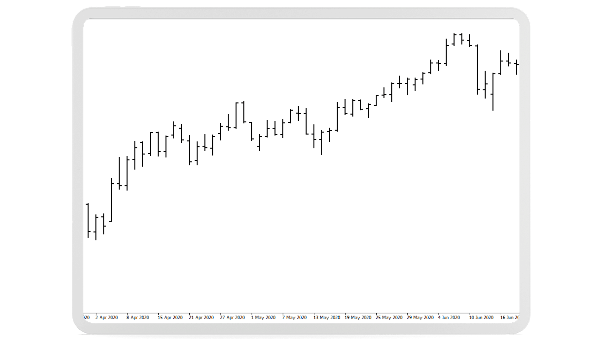
Bar Chart
Similar to bar charts, candlestick charts show four stock price variables: the open, close, low, and high. Candlestick charts use candles, which have a body and wick, to represent these prices. The wicks above and below connect the body to the day’s high and low prices, while the body connects the open and close prices. The open and close prices, which are essential trading indications, are easier to see in this format. Analysis is more effective since traders can instantly determine whether a time period was bullish (green candle) or bearish (red candle) based on the color of the candle body. Because of this, candlestick charts are frequently employed in the trading sector.
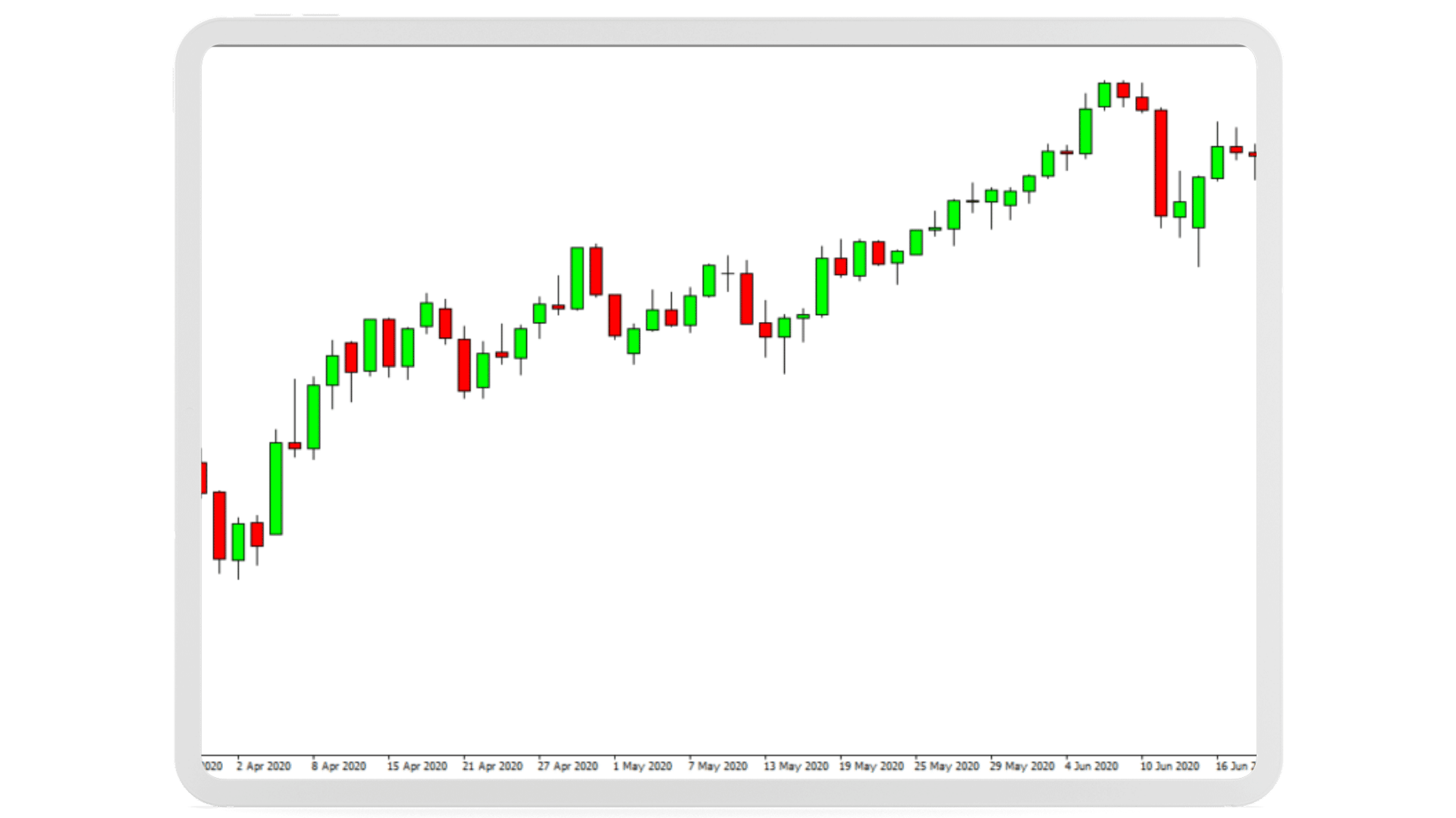
Candlestick Chart
Analyzing Stock Chart Patterns
The next stage after mastering chart reading is to use the chart data to identify profitable trading opportunities. Understanding how buyers and sellers behave on the market is necessary for this. Trading is made simpler and more profitable in this way. Trends, support and resistance levels, and candle patterns are three important factors to take into account while placing a trade.
Identifying Trend patterns
Making good trades requires being able to predict an asset’s movement over time, whether it be upward or downward.
You can choose to buy and possibly profit when the stock’s price increases by spotting a persistent trend with minor corrections and pullbacks. This tactic, nevertheless, works best for long-term investments.
Conversely, brief reversals in the stock’s price, where it goes against the trend, offer a fantastic opportunity to enter the trade at a discount and increase profits.
Recognizing Support and Resistance
The buying and selling behaviors of buyers (bulls) and sellers (bears) can be examined to discover the range within which stock values often move. If a stock’s trading range is $50 to $60, for example, bulls start buying the stock at $50 and drive the price up to $60 as demand rises. When prices reach $60, buying pressure lessens and bears take over, prompting a return to the $50 level. Bulls gain over at $50, which serves as the cycle’s support level, while $60 serves as the cycle’s resistance level (where bears resist further buying pressure).
Using support and resistance levels as a trading tool, trading methods can include purchasing at $50 and selling at $60 repeatedly or profiting from breakouts when a stock price breaches the support or resistance barriers. In the latter case, the price of the stock is typically driven for a while in the same direction by the winning side of the battle between bulls and bears.
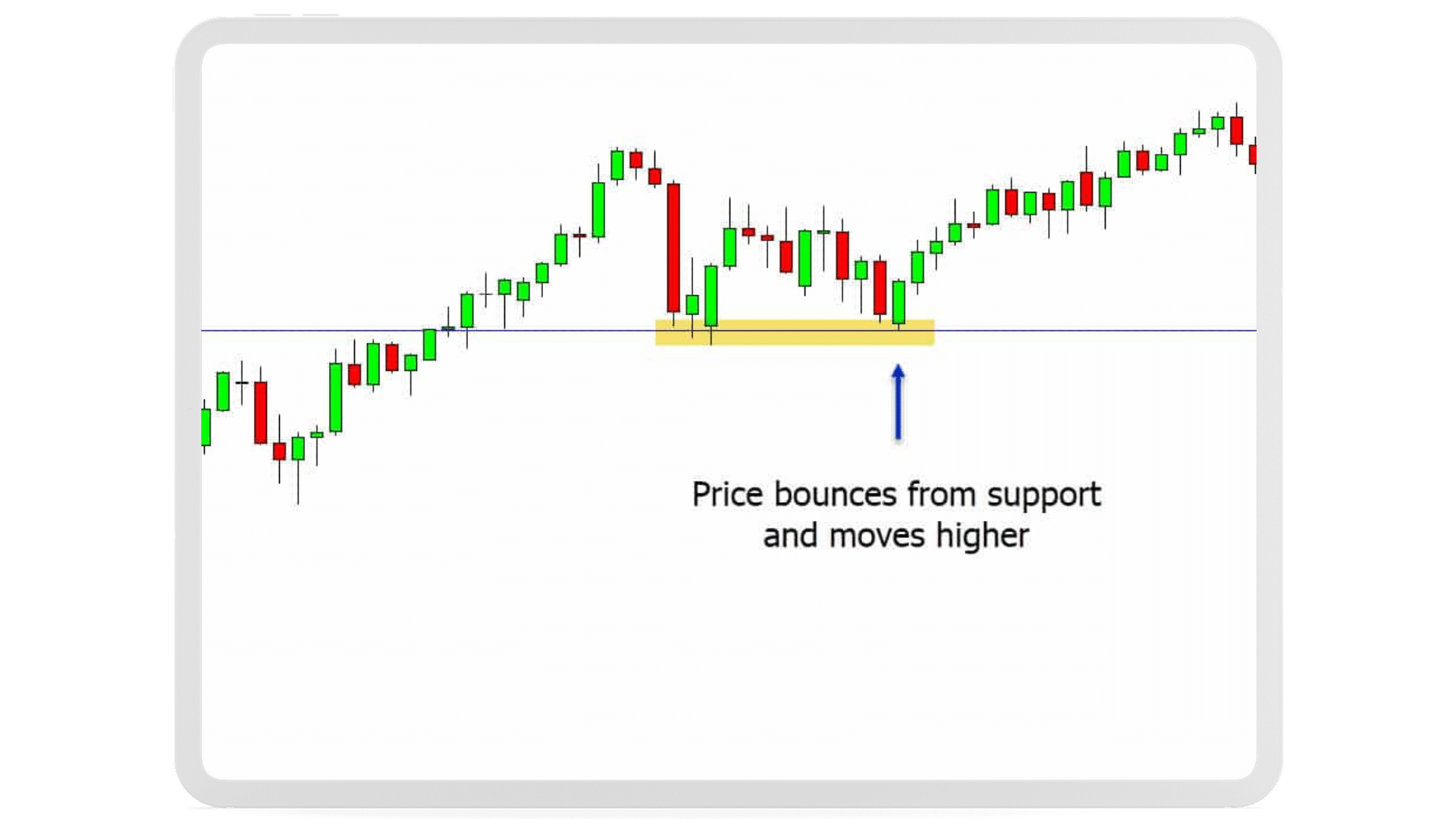
Recognizing Support and Resistance
Advanced Chart Patterns
In addition to the previously listed indicators, traders often look for prospective trading opportunities by analyzing complex candlestick patterns. Although the concepts can be used with candlestick charts of any time frame, this article will simplify things by using daily charts.
The Marobozu, Engulfing, and Head and Shoulders chart patterns have been included below as three of the most well-known chart patterns. However, traders can learn to recognize a variety of other candlestick patterns by studying them.
The Marubozu
The Marobozu is a straightforward candlestick pattern that features a body-only candle with no wicks. A strong bullish trend is indicated by a candle with a bullish body, which implies that buyers are eager to buy the stock at any price. A bearish Marobozu, on the other hand, signals a favorable moment to sell because prices are likely to continue falling in the near future. It shows that sellers are prepared to unload their shares at any price.
The Engulfing Formation
The engulfing pattern is a two-candlestick trend reversal indication. When a smaller candle is followed by a larger one that entirely engulfs the body of the earlier candle, it forms. This demonstrates a shift in market sentiment and marks the conclusion of the earlier trend.
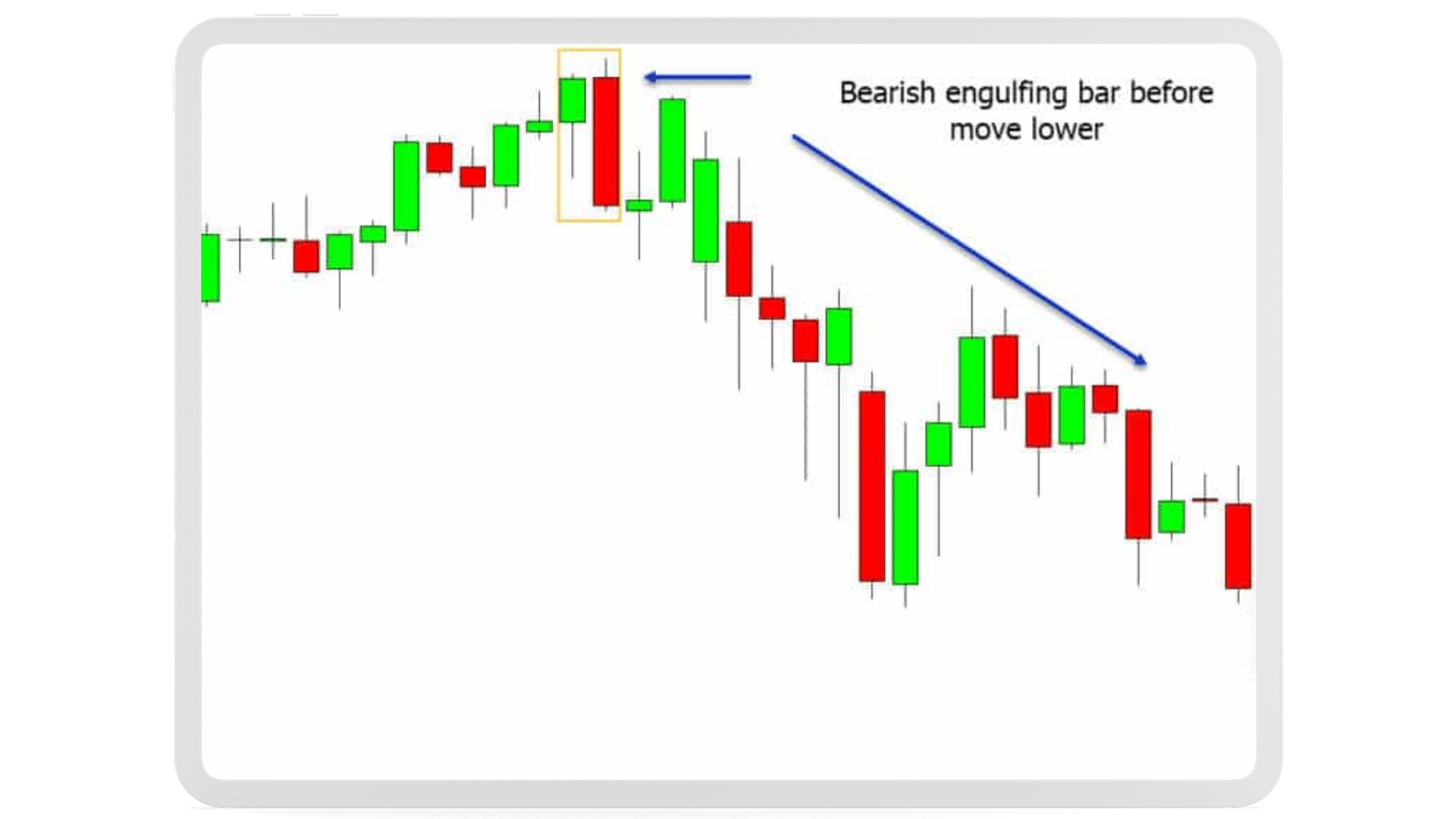
The Engulfing Formation
The Head and Shoulders Pattern
A multi-candlestick trend reversal indicator that necessitates careful attention is the “Head and Shoulders” pattern. It has three peaks, the first and final of which are about equal in height, and the second peak which is higher than both. The higher peak in the middle is viewed as the “head,” while the two outside peaks are considered as the “shoulders,” therefore the name. The majority of traders believe that this pattern is a solid indicator of a trend reversal.
Interpreting Stock Market Data
Traders must take into account more than just the fundamental facts shown in candlestick charts and trading patterns in order to assess and comprehend stock market data successfully. Traders need to use extra tools and indicators to support their judgments and lower the risk of losing trades in order to have a thorough grasp of the market.
Volume information, which offers knowledge of the number of shares being traded at any one time, is one such resource. With the help of this data, patterns and trends may be discovered, such as how a spike in volume within a certain time frame may indicate higher purchasing or selling activity. Understanding volume data can also give traders a clearer view of the state of the market as a whole and the viability of specific equities.
Volume Metrics
In addition to candlestick charts, many traders also utilize statistical indicators to re-confirm their trades.
The moving average, or arithmetic average of the closing price of the stock over the previous X days, is a straightforward indicator. Combining two moving averages is an easy method to spot bullish or bearish patterns.
Five and one hundred day moving averages are frequently drawn simultaneously. When the 5-day MA crosses the 100-day MA, it signals a bullish trend and a purchasing opportunity. A negative trend is indicated when the 5-day MA drops below the 100-day MA, and traders start to reduce their holdings of the stock.
There are a variety of other comparable indicators used by traders, including Bollinger Bands, Exponential Moving Averages, RSI values, etc.
Statistical Analysis
Many traders use statistical indicators in addition to candlestick charts to support their trading choices. The moving average, which is the average of a stock’s closing price over the previous X days, is one often used indicator. Using two moving averages together is a technique to spot bullish or bearish patterns.
The 5-day and 100-day moving averages are frequently plotted together by traders to aid with trend detection. A bullish indication and potential purchasing opportunity is spotted if the 5-day moving average crosses above the 100-day moving average. As a result, traders may decide to liquidate their positions in the company if the 5-day moving average declines below the 100-day moving average, which is regarded as a bearish indication.
Bollinger Bands, Exponential Moving Averages, RSI values, and other statistical indicators are also frequently used by traders. These indicators can further support the traders’ hypotheses and aid in the consistency of their trading selections.
Approaching Stock Chart Analysis for Day Trading
Following a disciplined method to spot trading opportunities is crucial for successfully using the knowledge from this article in day trading. Here are some ideas to get you going:
- Pick a group of stocks to pay attention to. The Dow Jones equities or those from the S&P 500 are two common choices.
- Examine these stocks’ daily charts for developing candlestick patterns. You will get better at detecting patterns in these well-known stocks over time.
- Determine the stock’s support and resistance levels after a discernible pattern has been found, then consider whether the price is simply bouncing between them or is about to break out.
- Strengthen your analysis by using the volume indicators. Look for a dramatic spike in volume if a breakout is thought to have occurred. Shallow volumes at levels of support or resistance, on the other hand, can suggest that prices are merely bouncing.
- Use external statistical techniques to confirm your idea one last time. Even while these indications alone do not ensure a trading opportunity, they can add to the evidence.
- Start opening a position if all the signs lead to a successful outcome.
- Every trader has their own unique methods, tastes, and habits that they build through time. Finding a method that suits your personal timetable, risk tolerance, expertise level, and personal preferences is crucial.
Be aware that as time goes on, you may grow more comfortable with specific candlestick patterns and discover that specific statistical indicators are used more frequently. Beginning traders can use the aforementioned procedures as a basis, but in the end, each trader needs to develop a method that works for them.